TIMELINE
May - Aug 2017 (14 weeks)
MY ROLE
UX writer
SKILLS
UI text
Content strategy
Style guides
Info architecture
UX research
TEAM
UX writers
Interaction designers
UX researchers
Project managers
Developers
** This project is subject to a non-disclosure agreement **

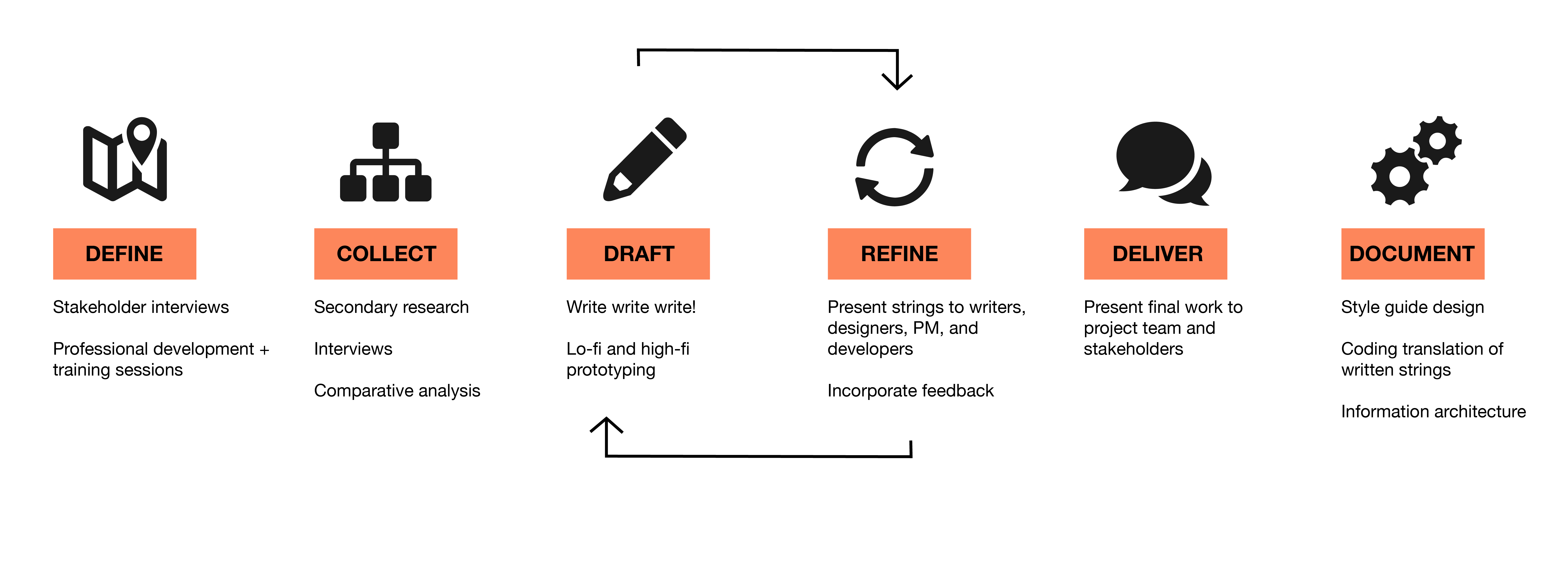
During my internship I tackled 2 main projects:
User-facing text: I created a series of timely content-based features for Google Search
Google-facing text: I created a comprehensive style guide that documents UI text rules for a major content area, so it can be expanded to other products across the company
I also assisted with usability testing, survey design, and other writing projects during my time as an intern. I spent time volunteering at an annual Google event and taught coding skills to young girls.
At the end of the summer I presented my work to the team of writers at Google Search and in an intern UX design showcase.
Guiding questions: Who is the target audience for this product / feature? Why are they motivated to use this product? What are they trying to understand or gain?
Through meetings with other Search writers and interaction designers, I learned that Google Search is a unique product because the audience is everyone, and that my goal was to craft interface text that is trusted by content area experts and still accessible to people who may not know as much about the subject.
Guiding questions: How do experts talk about this topic? What about novices? What are the technical terms, and what are the differences between a formal tone and an informal conversation?
I got to work on secondary research, covering subjects from what UI text has been written for similar products, and what language is used to describe this content area.
I consulted websites, television, radio programming, existing Google products, and content area experts to get a sense of the language used in this content area.
The next step was to compose UI text that fits product specs and is appropriate for both expert and novice users.
I worked with designers to define text placement and character length, and I partnered with PMs and developers to plan for implementation by selecting variable names and determining which data we can access and present.

After completing a finalized draft, I consulted the writing team, PM, interaction designers, and developers for feedback.
I also sought feedback from translation experts to identify potential problem areas and edits to phrasing and word choice.
I presented my final work to the Search writing team and to the PM. I also presented my work in a Google NYC event that showcased projects from all UX design interns.
I documented my process in a series of style guides that explain language, punctuation, and formatting choices.
These guides will be used internally by other Google product teams that want to incorporate information about this content area into their product.

"What is the brand identity that we are trying to convey?" or, in terms of UX writing, "What would our product say at a particular moment?"
Brand strategy should be embedded within all aspects of a product's design, but the product's voice (literally its personality, what it says, how it reacts to specific input) is an incredibly important piece that shapes user experience.
How would our product deliver good news (like a successful transaction) or bad news (like an error message)?
During my 14 weeks as a Google design intern I began to understand UX and product design in a way that I never had before: interactions as a conversation between a product and a user.
This metaphor of a conversation really helped me to refine my understanding of interaction design and user experience, because the language that a product uses determines how users interact with that product.
How informative are error messages? How many notifications are sent, and what information do those notifications contain?
When users understand how to use your product, and the words your product uses to communicate are seemlessly incorporated into all other aspects of the design, this builds confidence in your brand.
This comes from communicating highly technical information in an understandable way (empowering users to feel confident when they use your product) and incorporating the right amount of humor and delight.
And when users find delight in your product, this keeps them engaged.

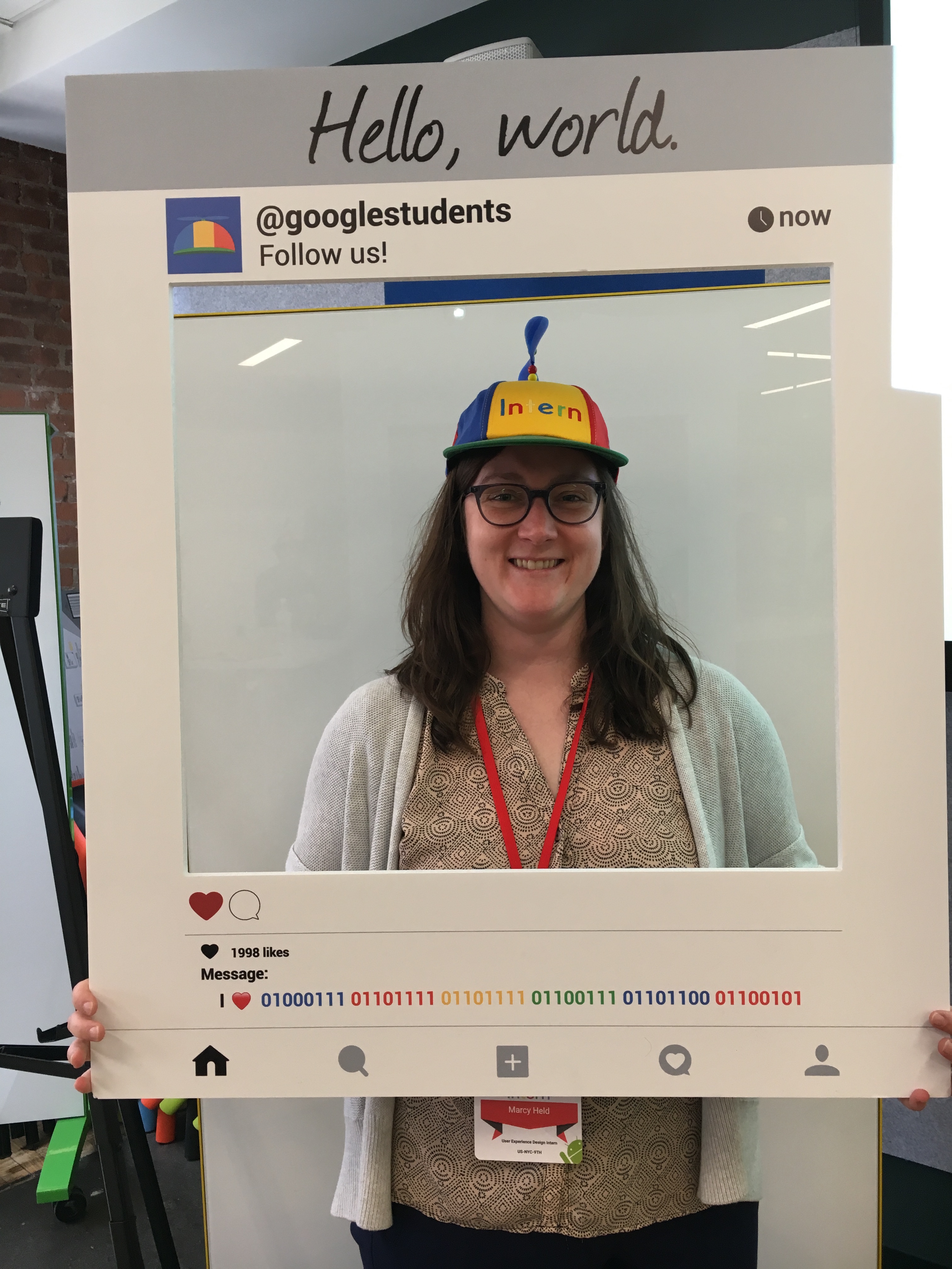
Obligatory noogler pic :)
Thank you to everyone I've worked with at Google.