TIMELINE
Feb - Apr 2017 (12 weeks)
MY ROLE
UX researcher
SKILLS
Feature analysis
Interviews
Survey design
Heuristic analysis
Usability testing
UX report writing
Project management
TEAM
Jatin Gupta
Kristen Mayer
Tongyun Shang
Shuyao Zhu
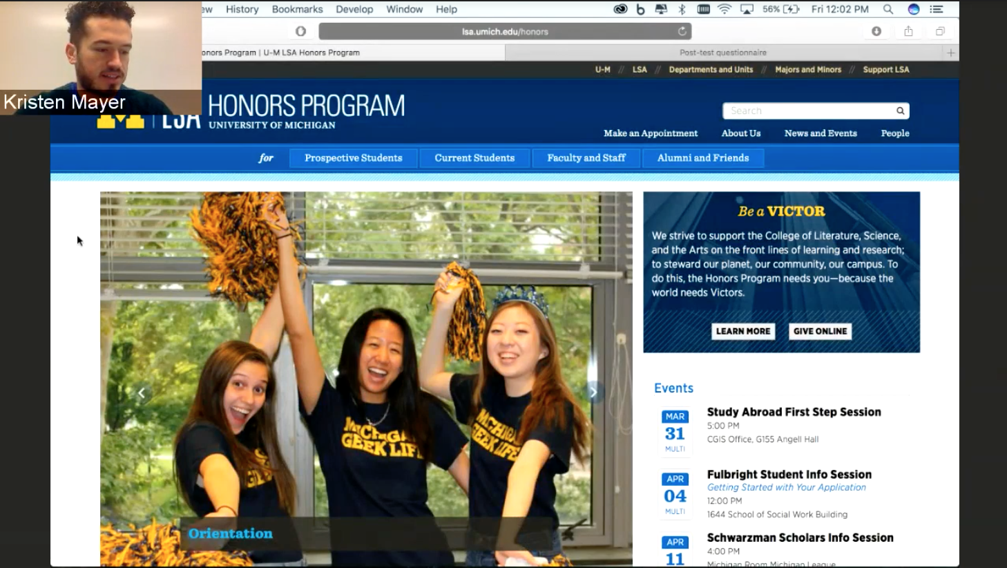
LSA Honors is a program within the University of Michigan's College of Literature, Science, and the Arts.
Staff members were overwhelmed with calls to the office and appointment requests from students asking for information that was presented on the website, and so the program's administrators reached out to collaborate on a project to identify ways to improve the site's usability for current students in the program.
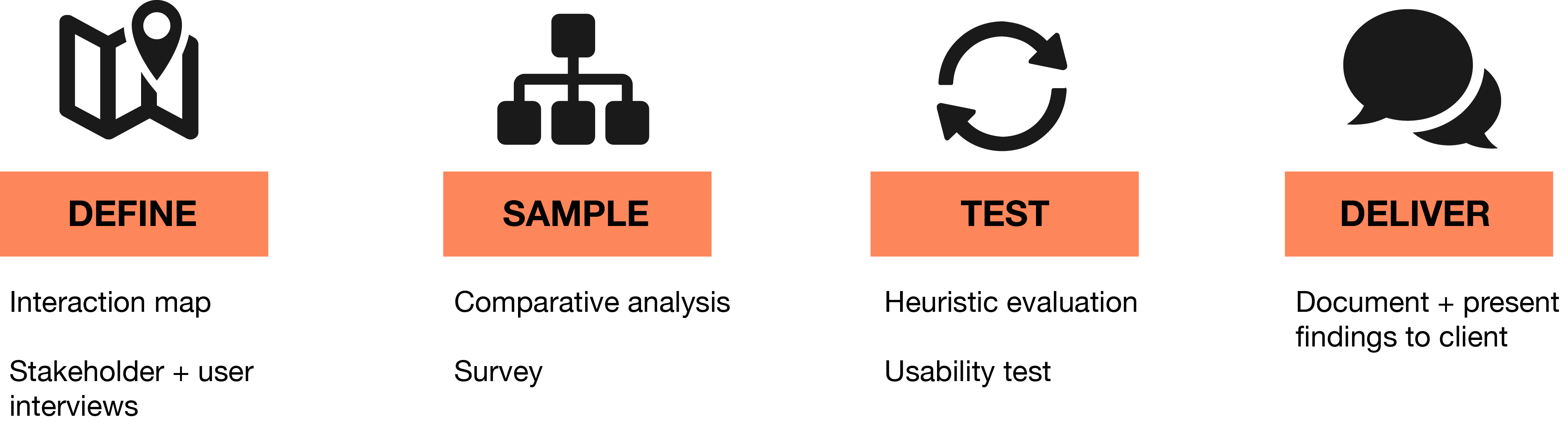
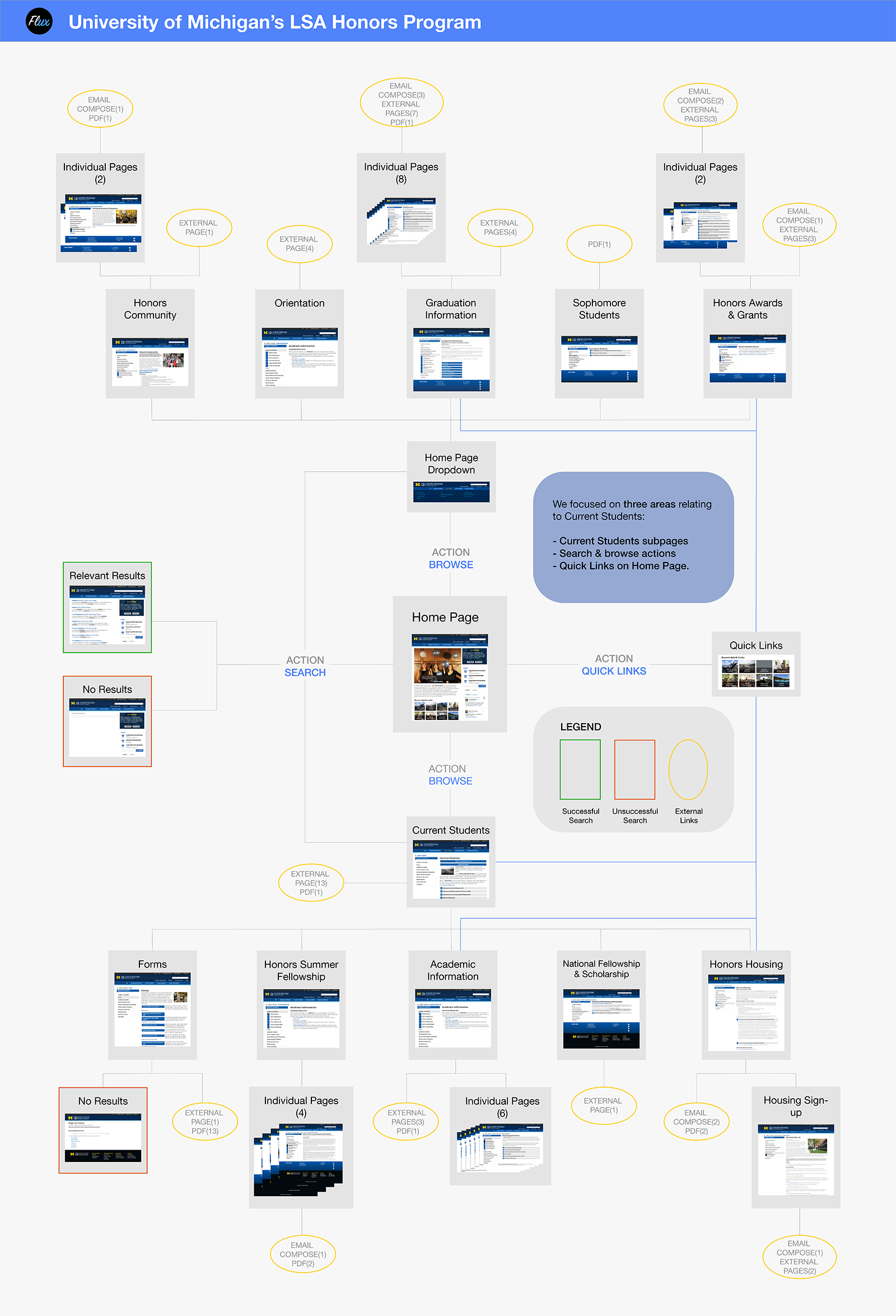
In order to understand current user flows through the LSA Honors site we created an interaction map to visualize the site's architecture.
This helped us to understand how information is currently organized on the site and to identify how information targeted toward current students fits within the site's overall information architecture.
We completed a series of stakeholder interviews to define project requirements and understand site and program administrators' goals for this project.
We also conducted user interviews with current LSA Honors students to understand how they use the site and how their information seeking behaviors change over the course of a semester and over their years in the program.
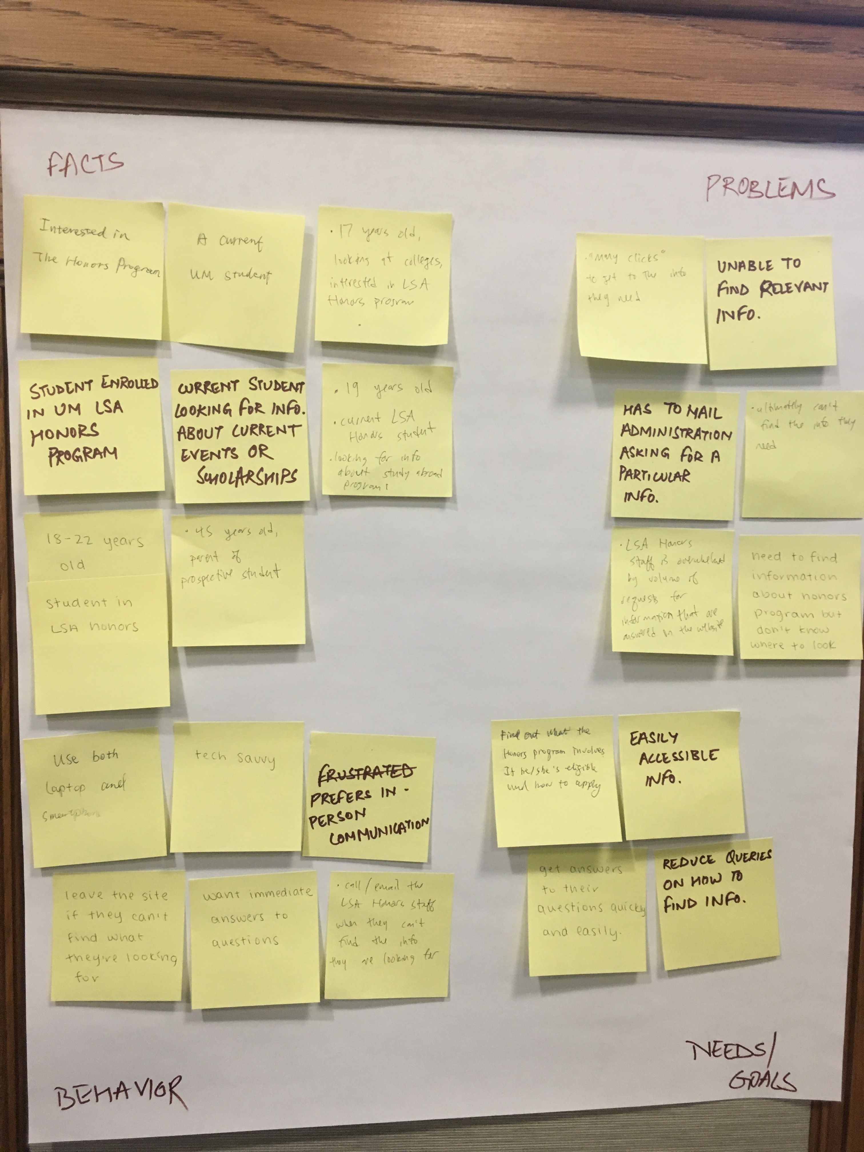
After conducting our interviews, we visualized our key takeaways from the interviews by grouping statements from our conversations into facts, problems, behaviors, and needs/goals.
For the website administrators, their recent adoption of a new content management system (mandated by the LSA college) caused them to make changes to the site layout.
From the students' perspective we found that they mostly use the LSA Honors website to find course information and program requirements, and that they prefer to access the site on a desktop. Text-heavy pages make it difficult to find specific information, and students usually make appointments with an advisor when they can't find the information they are looking for.
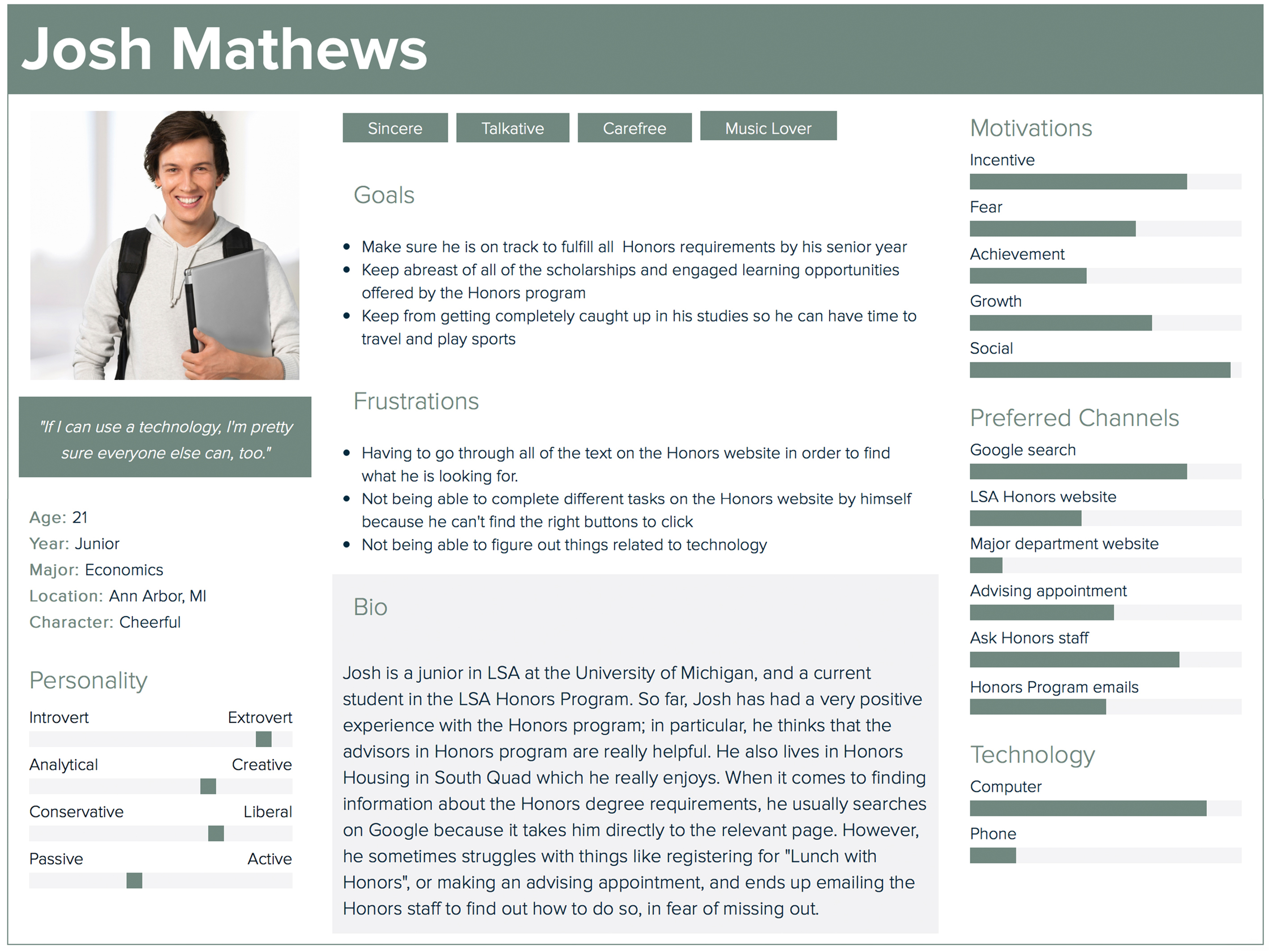
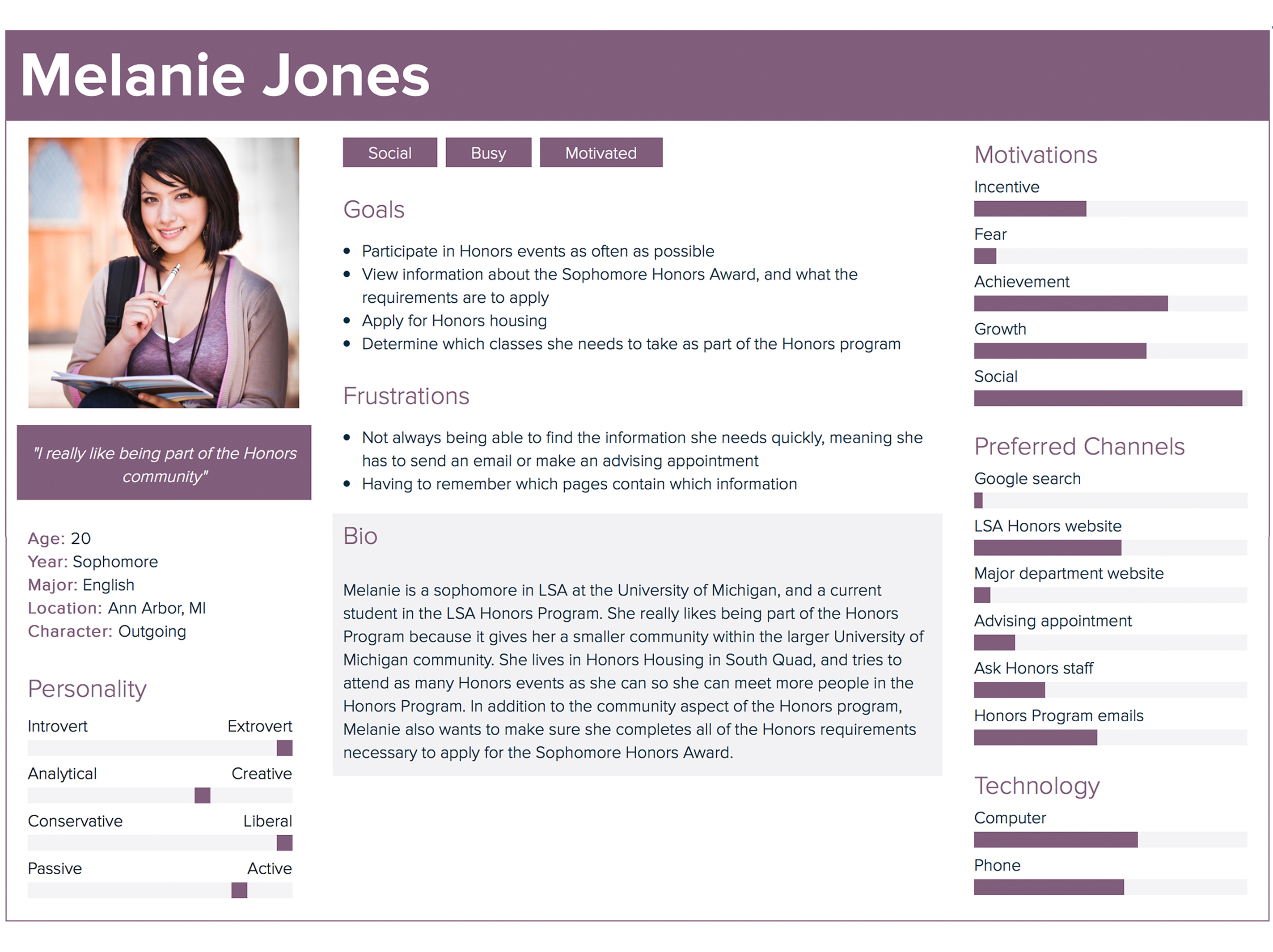
Based on our interview findings we created a set of personas that represent our target population for this project.

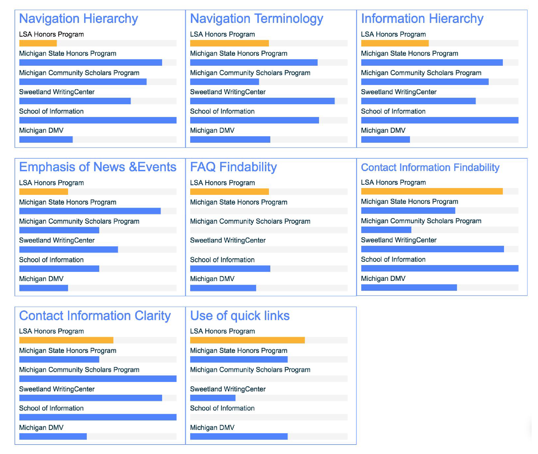
We analyzed the websites of a series of similar organizations to understand how they present information to their users.
A few of the organizations included on-campus student programs housed in other departments, honors programs at other universities, and government organizations whose websites serve the purpose of providing users with information about programs and services.
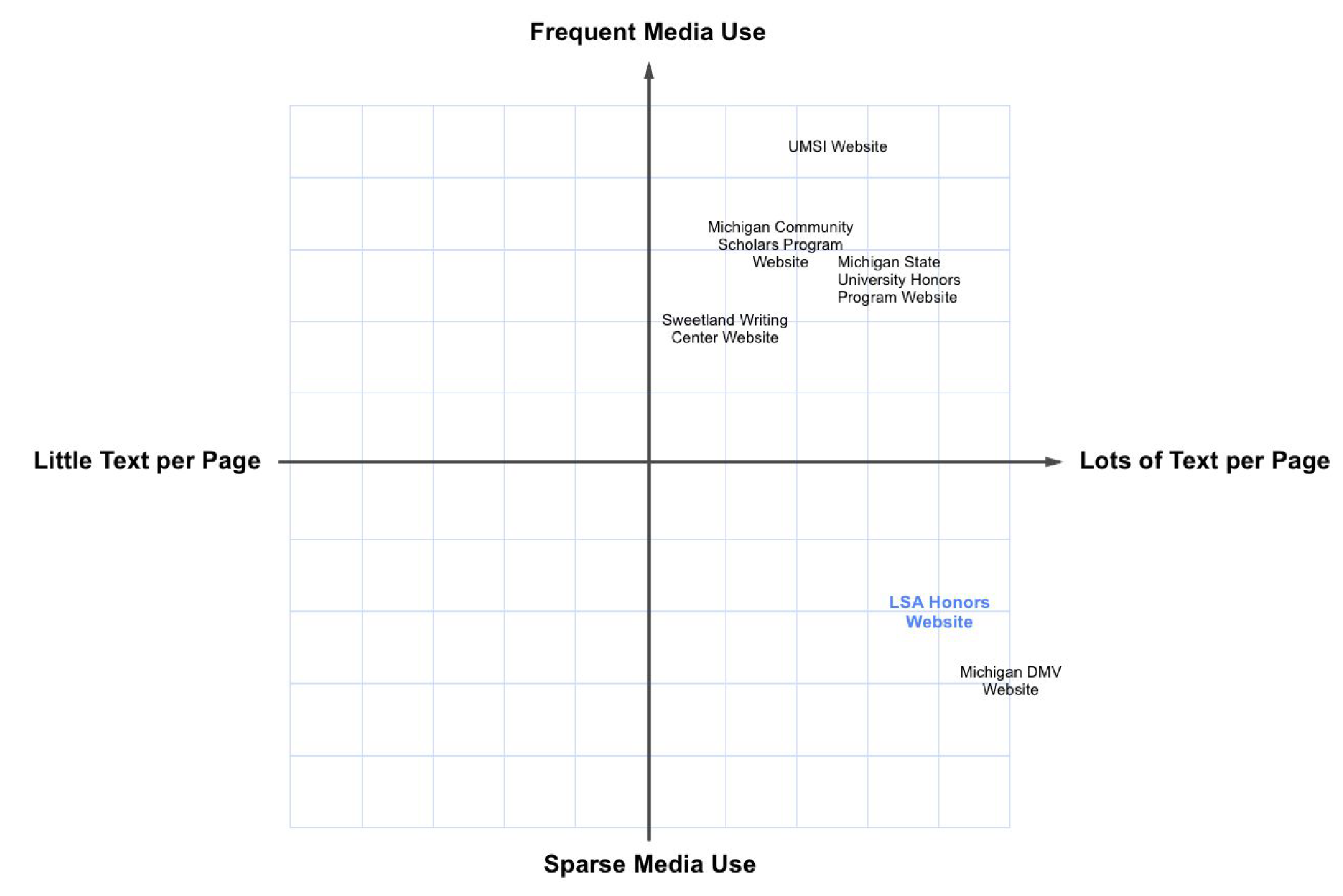
We compared these websites based on the following criteria: presentation of information, site navigation, use of quick links, display of news and events, FAQ, and findability of contact information.
Some of our findings included using images and other media which support the overall message of a page, in order to break up large chunks of text on a webpage and improve skimmability. We also found that using an FAQ page as a catch-all for common questions that do not fit into the content of any one page and are best answered directly is an effective way to connect users with the answers they may be seeking.
We created and distributed a survey to all current students in order to obtain more information about the characteristics, behaviors, and attitudes of current students toward the LSA Honors website.
With 28 survey responses, we were able to determine with 95% confidence which pages were visited most frequently, the desire for more media elements on the site, and the high frequency of in-person help (either from LSA staff advisors or from other students in the program).
We evaluated the LSA Honors website based on a combination of Nielsen's heuristics and our own heurisitc of site accessibility, and we found that some of the most pressing issues are: inconsistent formatting of links; accessibility issues for images, headings, and menus; and inconsistent styling of page headings.
We also suggest a broad, rather than deep, information architecture for site content areas like course requirments and information about currently offered LSA Honors courses.
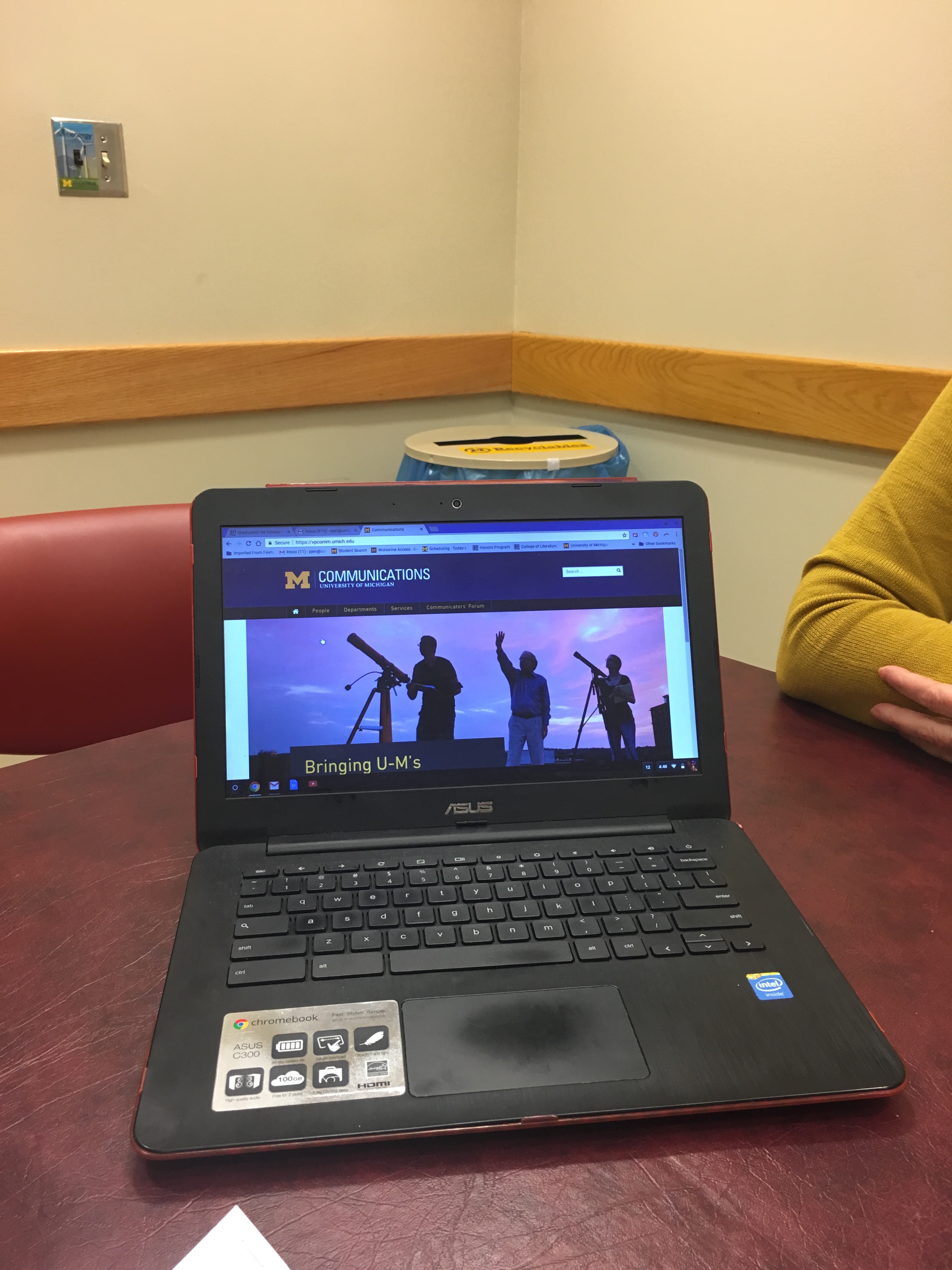
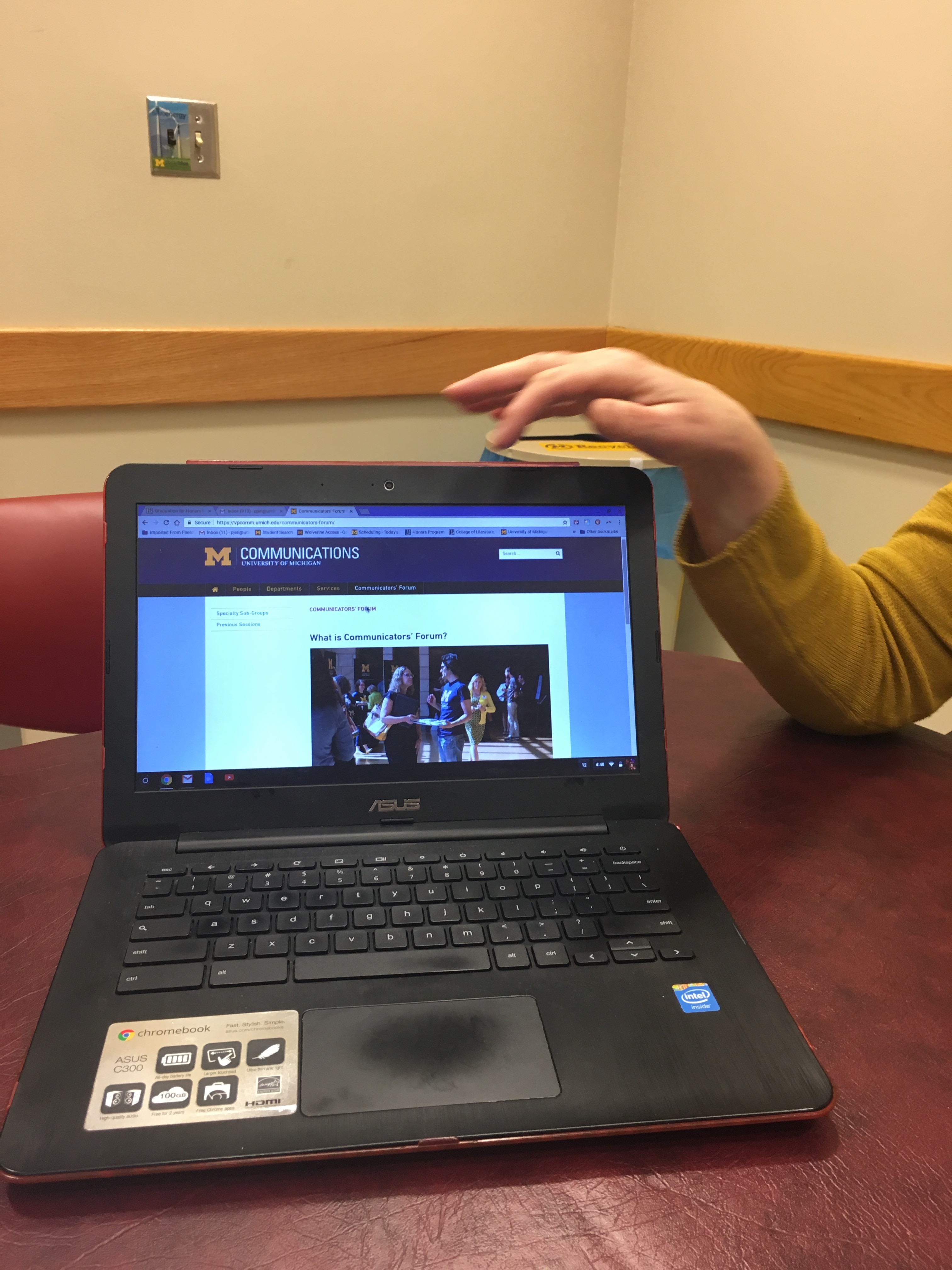
Based on our previous findings we created a series of tasks for a usability test that targeted the areas we found to be most problematic.
Our key findings include:
These findings led us to recommend a restructuring of the site's content and information architecture to better match student needs by changing the quick links on the homepage, remove duplicate paths to schedule an appointment, improve page title terminology so users better understand the content on each page, and split up large blocks of text to make information easier to find quickly.
We believe that participant recruitment created some bias in our results, as the students who participated in our studies were students that were regularly involved in LSA Honors programming and events, and were not representative of the program's students as a whole.
In this project we focused primarily on improving information-seeking behavior on the LSA Honors site. In the future, we could take steps to test navigation in other ways, like more observational ethnographic studies or card sorting. We could also test other aspects of the website, like measuring user sentiment instead of just task completion, and these findings could illuminate other strengths and new of improvement, as well as a new perspective on other ways to improve navigation.